Engineering · Design Systems · Part II
From Pipeline to Governed Artifacts
The token pipeline proved the foundation. As the system expanded across components, agents, Figma, Storybook, and a live product, we evolved it with typed contracts, portable mappings, readiness gates, durable evidence, and explicit ownership.
Contents
Part I established a working reference architecture: W3C design tokens compile into platform values, component intent becomes machine-readable, Figma maps back to production code, and Storybook closes the review loop. That foundation remains central to the system we use today.
Once the pipeline began serving multiple components and multiple agents, the next question naturally appeared: when five artifacts disagree, which one is allowed to win? A production system has a reference design, existing behavior, legacy components, generated CSS, Figma variants, catalog stories, accessibility constraints, and several agents editing them at different times. Scale called for a more precise model of where each kind of decision lives.
Stage II is additive: we kept the DTCG-to-CSS compiler, semantic layer, Figma mapping, and Storybook review loop. We added a control plane for decisions: where meaning lives, how it is projected into each surface, what has been proven, and which earlier explorations should remain part of the system’s memory.
What Stage II adds
The Part I pipeline now sits inside a governed artifact graph. DTCG remains canonical for machine values, while component behavior, lifecycle, mapping, and design rationale each gain a clearly named home.
| Part I foundation | Stage II evolution |
|---|---|
| DTCG as the source of truth for values | One authoritative owner per concern across the wider system |
| Component guidance in DESIGN.md | Global principles in DESIGN.md; typed semantics in definition.yaml |
| Authored agent documentation | spec.md generated from the typed definition |
| Code Connect closes the loop | Portable mapping.json complements provider transports |
| Storybook and CI validate output | Explicit readiness, gates, browser evidence, human approval, and history |
| Components as the main unit | Components, patterns, templates, and behaviors form a graph; foundations remain global authorities beneath it |
| Generated CSS is production CSS | Full generated prototype plus an exact-allowlist runtime overlay during migration |
The current architecture: one owner per concern
“Single source of truth” remains exact for a narrow value pipeline. At the scale of a whole design system, we made the idea more precise: a token file can own the value of color.action.primary.default; it cannot also own whether a Button uses native disabled behavior, which Figma node represents it, whether its visual review passed, or why a contrast exception was accepted.
The production model therefore uses federated authority with exclusive ownership: several authoritative files, but exactly one owner for each kind of decision.
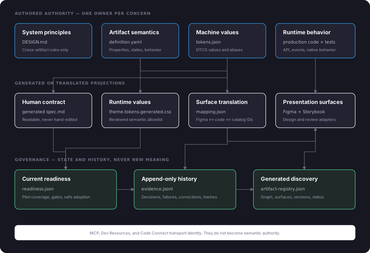
current agentic design-system architecture
| Concern | Owner | It must not define |
|---|---|---|
| System principles | DESIGN.md | Component variants or readiness |
| Artifact semantics | definition.yaml | Figma IDs, gates, or history |
| Machine values | tokens.json | Runtime behavior |
| Runtime API and behavior | Production code and tests | Ratified visual intent |
| Cross-surface identity | mapping.json | New semantics or lifecycle state |
| Current delivery state | readiness.json | Target semantics |
| Historical evidence | evidence.jsonl | Current state |
The result is more explicit than a universal source file and simpler to operate: when Figma and code disagree, the answer follows ownership rules instead of depending on which file an agent opened first.
The governed unit is an artifact
Every governed element gets a stable semantic ID such as action.button, navigation.tabs, or workflow.kanban-board. The directory is deliberately boring:
action.button/
├── definition.yaml   # authored semantic authority
├── spec.md           # generated human-readable contract
├── mapping.json      # Figma ↔ code ↔ catalog translation
├── readiness.json    # current gates and safe adoption scope
└── evidence.jsonl    # append-only, hash-chained history
docs/design_system/artifacts/action.button/
The separation is the feature. A mapping can change because a Figma node was recreated without changing what Button means. A visual gate can pause adoption without rewriting the contract. A later decision can supersede an evidence record while preserving the earlier exploration and the context it contributed.
1. Author meaning in definition.yaml
The definition stays renderer-agnostic. It describes purpose, boundary, properties, states, behavior, accessibility, relationships, tokens, deviations, and non-goals. The non-goals matter as much as the supported API: they stop an agent from promoting a convenient legacy option into the clean system.
meta:
  schema: enaia-design-system-spec/v1
  id: action.button
  name: Button
  kind: component
  version: 0.1.0
  status: ratified

purpose_and_boundary: |-
  Button is a labeled native control that triggers one
  primary or supporting action. It does not represent
  selection, view navigation, or an icon-only action.

properties:
  - name: hierarchy
    kind: variant
    values: [primary, secondary]
    default: primary
    value_intent:
      primary: The main action the user is expected to take.
      secondary: A supporting action shown alongside a primary.

states:
  - state: focus-visible
    trigger: keyboard focus
    description: Shows the shared focus ring.

behavior:
  - name: native-disabled
    requirement: Use the native disabled attribute.

non_goals: |-
  Icon-only, destructive, tertiary, loading, pressed,
  and trailing-icon treatments are outside this contract.
action.button/definition.yaml, excerpt
2. Generate the readable specification
Part I introduced Markdown as an accessible agent-facing layer. As the number of contracts grew, we retained Markdown as the readable output and moved repeatable semantics into typed YAML. The current pipeline authors definition.yaml and generates spec.md.
$ mix design_system.docs action.button
Generated docs/design_system/artifacts/action.button/spec.md

$ mix design_system.docs action.button --check
# renders the projection without writing
generation and drift check
Humans get a readable contract with tables and rationale; agents get stable fields; neither can silently disagree. A semantic refinement always starts in definition.yaml.
3. Translate identity in mapping.json
Figma calls a property Hierarchy. Phoenix calls it hierarchy. The selected state is a Figma variant but hover and focus are CSS pseudo-states; they are not production component properties. Those translations are explicit data, not tribal knowledge.
{
  "artifact": {
    "id": "action.button",
    "version": "0.1.0"
  },
  "figma": {
    "file_key": "vM3hWCHq7MeA9QpicZ6U06",
    "component_set_node_id": "28:34",
    "properties": {
      "Hierarchy": "hierarchy",
      "Size": "size",
      "State=Disabled": "disabled",
      "State=Hover": ":hover",
      "State=Focus": ":focus-visible",
      "Label": "inner_block"
    }
  },
  "phoenix": {
    "module": "EnaiaWeb.Components.Core",
    "entry_point": "button/1",
    "clean_opt_in": "design_system={:clean}"
  },
  "storybook": {
    "story_url": "/storybook/button"
  }
}
action.button/mapping.json, excerpt
This complements Code Connect. Code Connect is a useful transport when a plan supports it; mapping.json keeps the identity portable whether that transport is available or not. The design-to-code contract can therefore survive a provider or plan change.
4. Keep readiness separate from the target
A component can have a ratified target and only a validated subset. It can be implemented but not adoptable. It can be adoptable for one API while legacy variants remain outside the contract. Flattening those into a single “done” badge encourages false claims.
{
  "artifact": { "id": "action.button" },
  "pilot": {
    "status": "validated",
    "included_properties": {
      "hierarchy": ["primary", "secondary"],
      "size": ["medium", "small"]
    },
    "included_states": ["default", "hover", "focus-visible", "disabled"]
  },
  "gates": {
    "authority_contract": { "status": "passed" },
    "token_integrity": { "status": "passed" },
    "figma_component": { "status": "passed" },
    "implementation": { "status": "passed" },
    "accessibility": { "status": "passed" },
    "visual": { "status": "passed" },
    "portable_mapping": { "status": "passed" },
    "drift": { "status": "passed" }
  },
  "adoption": {
    "status": "adoptable",
    "safe_contract": [
      "design_system={:clean}",
      "hierarchy primary or secondary",
      "size medium or small"
    ]
  }
}
action.button/readiness.json, reduced example
5. Append evidence last
Evidence is JSON Lines rather than a mutable report. Every record carries the previous record hash and its own hash. Decisions, explorations, refinements, validation, and adoption accumulate in order.
{
  "timestamp": "2026-07-11T20:36:30Z",
  "phase": "P0",
  "kind": "decision",
  "summary": "Selected portable mapping plus Storybook",
  "result": "Code Connect remains optional; stable IDs stay upgrade-ready",
  "previous_hash": "454f877f…",
  "record_hash": "406e9a29…"
}
action.button/evidence.jsonl, one record
The order matters: change the owning artifact, regenerate projections, propagate to surfaces, validate, update readiness, and only then append evidence. If a gate does not pass, the work returns to the owning artifact rather than changing a screenshot or generated spec.
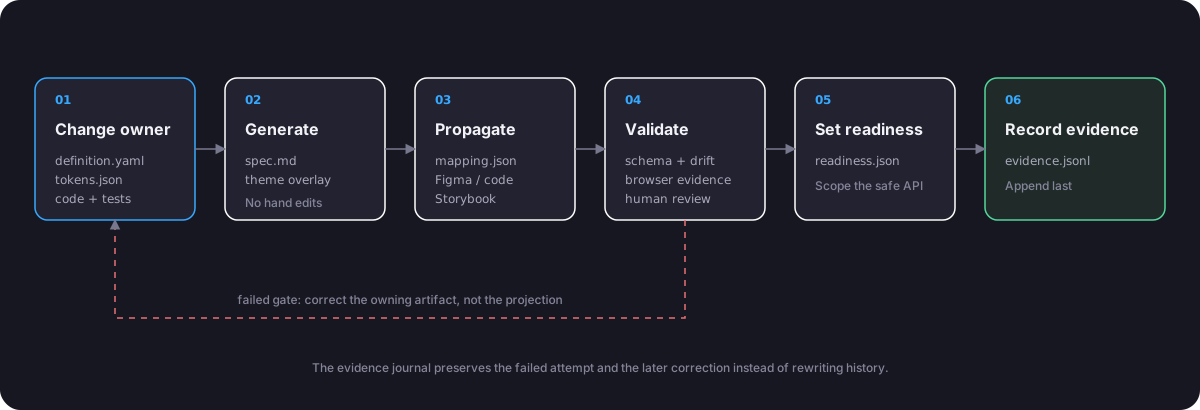
governed change flow
Figma becomes a connected design surface
The dedicated Figma library remains essential: it holds token-bound components, named variants, reusable composition, and stable node IDs. Stage II gives it a precise role as the design surface of a ratified contract, connected to the other artifacts through portable mappings.
The first Button pilot created a 16-variant component set across two hierarchies, two sizes, and four states. Its documentation frame carries the semantic artifact ID, production entry point, Storybook route, and explicit visual authority.
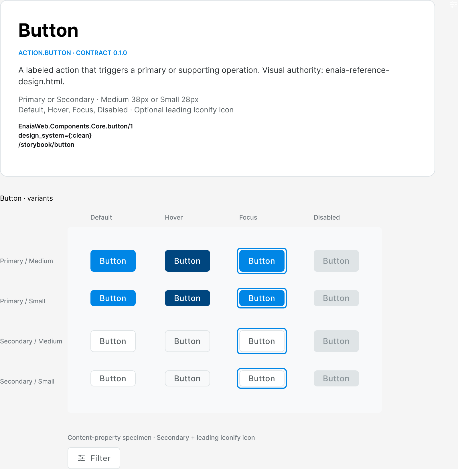
The real Button page in the Enaia Design System Figma file. The component matrix is bound to the same semantic properties recorded in definition.yaml and mapping.json.
Figma variants are not copied blindly into runtime props. Hover and focus are specimens in Figma, but browser states in production. Disabled maps to the native HTML attribute. Treating every visual state as a component assign would couple the runtime API to the design tool instead of preserving native browser behavior.
Responsive behavior also needs a contract richer than a static component matrix. Tabs are one non-wrapping row. When the available viewport is narrower than that row, the same component scrolls horizontally; overflow belongs to the containing context rather than a second visual variant. Production still owns keyboard and panel lifecycle behavior.
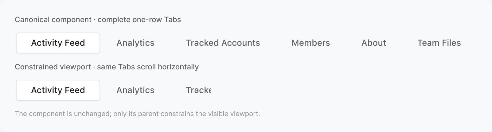
The mapped Tabs component is shown complete first. Below it, the same instance sits inside a labeled 320px viewport to demonstrate contextual horizontal scrolling. The component itself does not change or wrap.
Components became a graph
Button proved the first vertical slice. Kanban extended the approach into composition: a generic Card is used by Kanban Card; Kanban Cards live in Kanban Columns; the Board composes Columns and canonical Tabs. Stable relationships let an agent reason through the dependency graph instead of treating every screenshot as fresh markup.
Card composition
  surface.card
    │ used_by
    ▼
  workflow.kanban-card
    │ composed_by
    ▼
  workflow.kanban-column ──┐
                           │
Direct controls            │
  navigation.tabs ─────────┤ composed_by
  action.button ───────────┤
                           ▼
Composition target
  workflow.kanban-board
generated artifact graph, simplified
The registry is generated from the artifact directories. It indexes identity, version, relationships, mapped surfaces, pilot status, and adoption. It is excellent discovery data for agents and Storybook; it is not another place where a designer can invent a property.
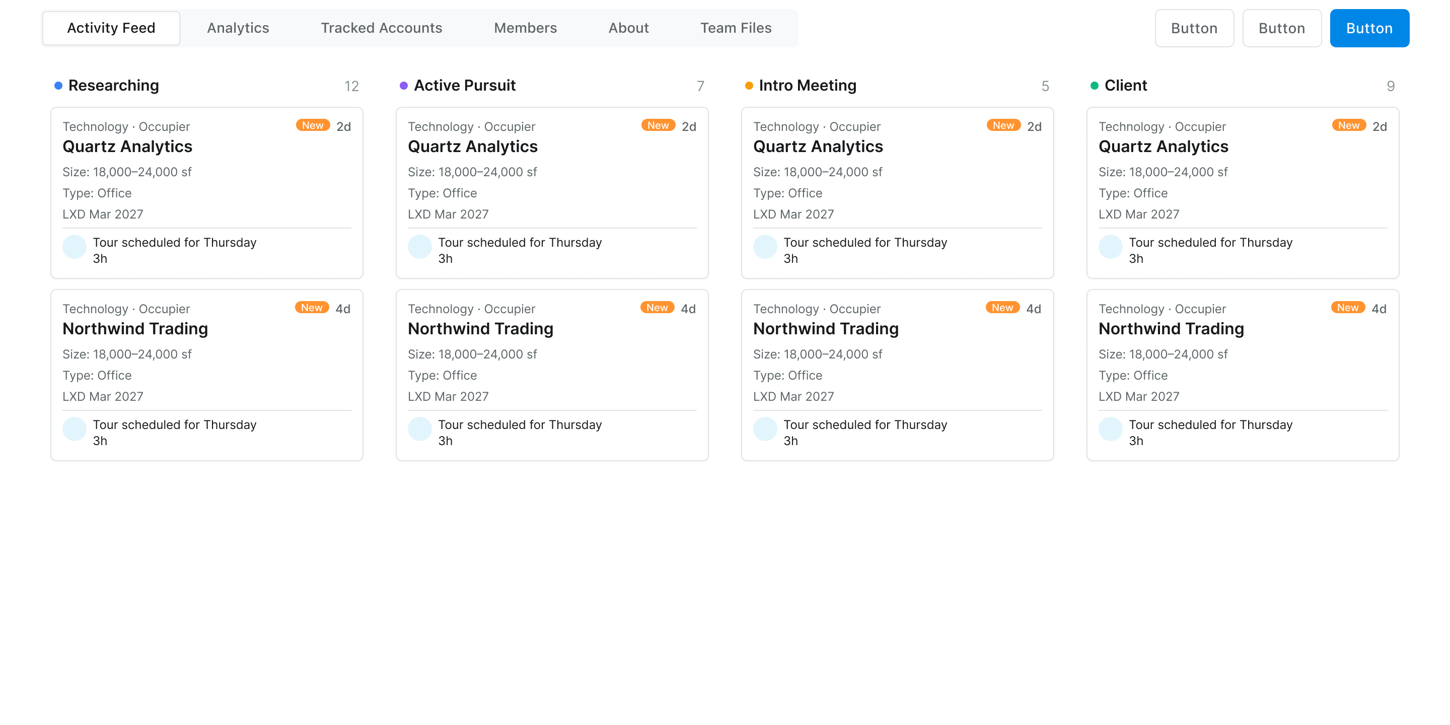
The composed Kanban Board in Figma. Its toolbar now shows the complete canonical Tabs row; it reuses mapped Tabs, Buttons, Columns, and Cards rather than drawing a disconnected page mockup.
Governed artifacts can be components, patterns, templates, or behaviors. Foundations deliberately sit beneath that graph: DESIGN.md establishes system-wide rules, while tokens.json remains the independent machine authority for token names, values, types, and aliases. The current cohort instantiates component artifacts first; the other kinds become useful when genuinely shared contracts emerge. Mobile Kanban drag-and-drop, for example, is not merely styling: long-press activation, scroll locking, edge-triggered column movement, snapping, and release form a state machine. Today that policy belongs to the workflow.kanban-board component artifact because it is board-specific. If another component needs the same policy, it can be extracted into a shared behavior artifact and both components can declare that they conform to it.
The migration architecture mattered as much as the target
The cleanest design-system diagrams assume the codebase starts clean. Enaia did not. It had a historical html { font-size: 62.5% } convention, multiple component generations, hand-maintained theme values, and third-party components calibrated for the browser-standard root.
Flipping the root from 10px-like rem arithmetic to the standard 16px root could not be a global search-and-replace. It affected line boxes, Tailwind’s type scale, reports, generated utility candidates, JavaScript-authored styles, and dependencies. The migration therefore established two explicit lanes:
- Compatibility lane: existing unswept UI keeps exact pixel-equivalent behavior until its bounded redesign.
- Clean lane: redesigned components use the standard root, honest semantics, reviewed tokens, and no new compatibility debt.
The token compiler follows the same staged logic. A full generated theme exists, but it is not imported. During migration, production imports a small, exact-allowlist semantic overlay after the compatibility theme.
# Complete inspection target; deliberately not imported
mix tokens.build
# → assets/css/theme.generated.css

# Reviewed semantic subset used by the running app
mix tokens.build --target runtime
# → assets/css/theme.tokens.generated.css

# CI drift guards
mix tokens.build --check
mix tokens.build --target runtime --check
the two generated targets
Generated output still needs an adoption boundary. A compiler can produce a correct global override before the product is ready to consume it everywhere.
The full output can redefine Tailwind-owned namespaces such as type, radius, or spacing. Importing it before those namespaces have been reconciled across the whole application would make the build beautifully deterministic while changing more of the application than the current migration stage intends.
Evidence moved from scripts into data
The first component used a dedicated browser script, which was an effective pilot. Repeating the pattern on the next component revealed the opportunity to generalize: one validator per component would make every new artifact create permanent tooling. A shared executor could keep the component work declarative instead.
The evolved form is one generic Python Playwright executor plus a component-owned JSON evidence spec. The runner knows how to read DOM state, computed styles, bounding boxes, overflow, contrast, genuine keyboard input, events, screenshots, and errors. It knows nothing about Buttons, Tabs, or Kanban.
{
  "componentId": "workflow.kanban-board",
  "url": "http://localhost:4000/storybook/kanban_board",
  "figmaCrossCheck": {
    "fileKey": "vM3hWCHq7MeA9QpicZ6U06",
    "componentSetNodeId": "139:47",
    "variantCount": 1
  },
  "steps": [
    {
      "action": "assert",
      "id": "responsive.column-minimum",
      "kind": "visual",
      "read": {
        "type": "style",
        "selector": "[data-kanban-column-frame]",
        "name": "minWidth"
      },
      "expected": "260px"
    },
    {
      "action": "assert",
      "id": "accessibility.named-tab-list",
      "kind": "accessibility",
      "read": {
        "type": "attribute",
        "selector": "[role=tablist]",
        "name": "aria-label"
      },
      "expected": "Tabs"
    },
    {
      "action": "capture",
      "selector": "main",
      "path": "storybook-board.png"
    }
  ]
}
workflow.kanban-board/browser-evidence-spec.json, excerpt
The resulting capture comes from the real production component rendered in Phoenix Storybook, not duplicate specimen markup. Its evidence file hashes the spec, shared runner, declared authorities, source files, and screenshots so stale proof can be rejected.
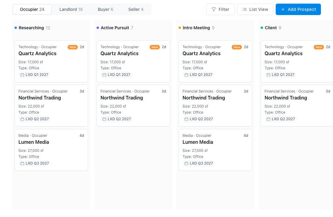
The matching production-backed Storybook capture. Automated evidence proves selected geometry, semantics, events, and deterministic state; a human still approves material visual differences.
What the evolution taught us
1. One source of truth evolves into one owner per concern
There is one owner for token values and another for runtime behavior. At system scale, the useful discipline is not “one file”; it is one owner per concern and no independently authored projection.
2. Generated documentation becomes natural at scale
Hand-authored prose is valuable for principles and rationale. It is a less efficient duplicate of a property schema once many components share the same structure. Generate the repetitive contract, keep the real decisions authored, and make drift mechanically impossible.
3. Portable mapping complements provider transport
MCP, Code Connect, Dev Resources, and Storybook links transport identity. A portable mapping lets those useful adapters change with provider availability, subscription tier, or a recreated Figma node without redefining the component.
4. Maturity needs several statuses
A target can be approved before its pilot is validated. A pilot can be validated while only a narrow API is ready for adoption. Separating those statuses makes rollout scope explicit.
5. History compounds learning
The Button pilot proposed a darker blue to pass normal-text contrast. Human review preferred reference parity and recorded the contrast gap as an explicit exception. Keeping both the explored alternative and the final decision preserves the useful context: what was tested, why another direction was chosen, and what should happen before revisiting it.
6. Successful one-offs reveal reusable infrastructure
The component-specific validator proved browser evidence could work. The shared executor plus declarative evidence schema then made each subsequent component cheaper and kept component differences where they belong: in data, tests, and the contract.
7. Human review remains product judgment
Automated checks can prove source hashes, token aliases, selectors, keyboard activation, contrast calculations, and geometry. They cannot decide whether a neutral outline feels too heavy, whether a report page has the right rhythm, or whether an intentional reference deviation is better. An honest system records that boundary.
8. Governance is a stage, not an entry requirement
Not every team needs readiness ledgers and hash-chained evidence on day one. The reusable workflow now starts with an MVP (principles, tokens, Figma, production code, Storybook, focused tests, human review) and adds mapping, prototyping adapters, governance, or enterprise reporting only when repeated work justifies them. Enaia crossed that threshold because multiple agents and repeated component sweeps needed restartable state.
Validate broadly, then roll out widely
We are deliberately validating and polishing the operating model before rolling it across the dozens of components a mature product needs. The initial cohort spans a useful cross-section: primitive actions, navigation, a generic surface, domain-specific cards and columns, and a composed Kanban workflow. That range exercises tokens, variants, runtime behavior, accessibility, responsive composition, mapping, evidence, and dependency relationships, not merely a large count of similar components.
The next stage is multiplication: apply the stable workflow across the broader component inventory while continuing to shrink the compatibility lane. A few architectural refinements remain visible as that rollout proceeds. The runtime API can move from compiled-code references to a generated manifest; semantic validation can become richer; cross-cutting Kanban gestures can become the first dedicated behavior artifact; and the full generated theme can be adopted namespace by namespace.
The architecture in one rule
Part I argued that the compiler is the bridge between tokens and code. That remains true. Part II extends the architecture with one operating rule:
Change the artifact that owns the decision. Generate every projection you can. Translate identity explicitly. Prove the result. Record history last.
That is what makes the system agentic. Not that an agent can draw a Button, but that it can determine which Button is canonical, understand its boundary, map it across tools, know whether it is safe to adopt, and learn from the alternatives explored three weeks ago.
Tokens give agents values. Typed contracts give them meaning. Mappings give them identity. Readiness gives them permission. Evidence gives them memory.
Sources / further reading
- Building an Agentic Design System: Tokens, MCP, and Code Connect, Part I of this implementation story.
- W3C Design Tokens Community Group, the language-agnostic token format used for machine values.
- Figma MCP server and Code Connect documentation, the design-canvas transport layer discussed above.
- Tailwind CSS theme variables, the runtime namespace targeted by the generated token compiler.
- Enaia, the commercial-real-estate product used as the production case study.